

Project overview
Project opportunity
Sabi offers B2B services related to business development and ecommerce to small businesses in Africa and global companies interested in connecting with African markets. They approached us wanting to refresh their brand image in a way that would let them communicate their value more effectively to the big players in the market.
To do that, they needed a new visual identity and a completely redesigned website to clearly communicate their services, build trust with their potential clients, and evoke an image of a solid partner and a technologically advanced B2B service provider.
247 solution
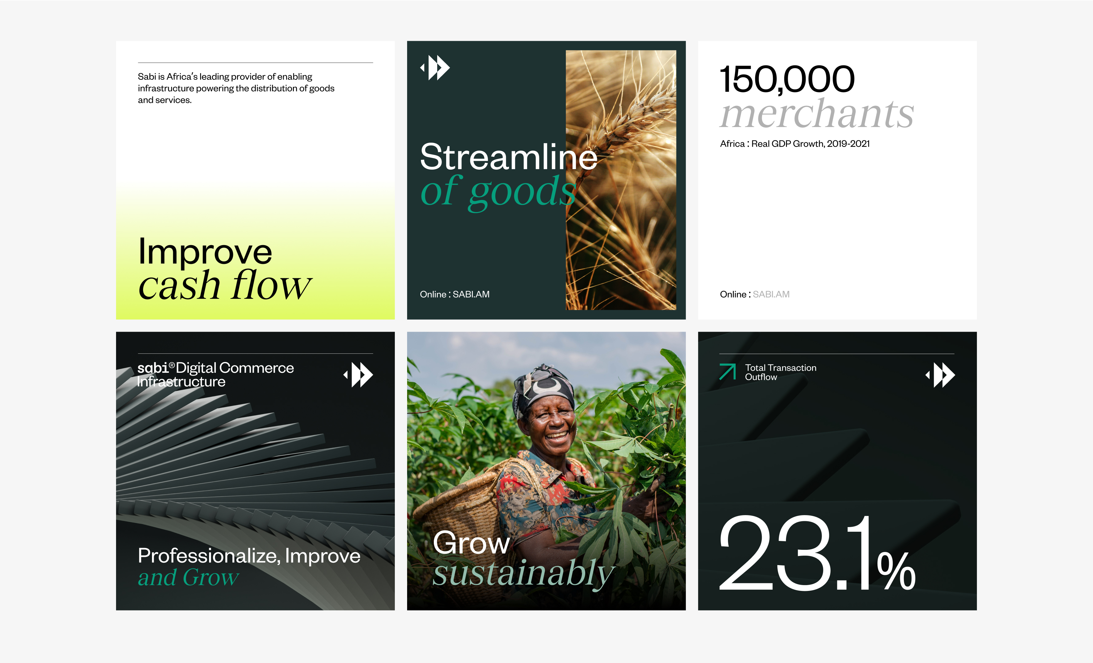
We kicked off the project with a strategic workshop to clearly define the brand’s goals, values, and market differentiators. And then, we started exploring ways to turn those into the new branding and visual identity. It was clear that the old branding wasn’t really successful at showing the company’s scale and the tech advancements it used.
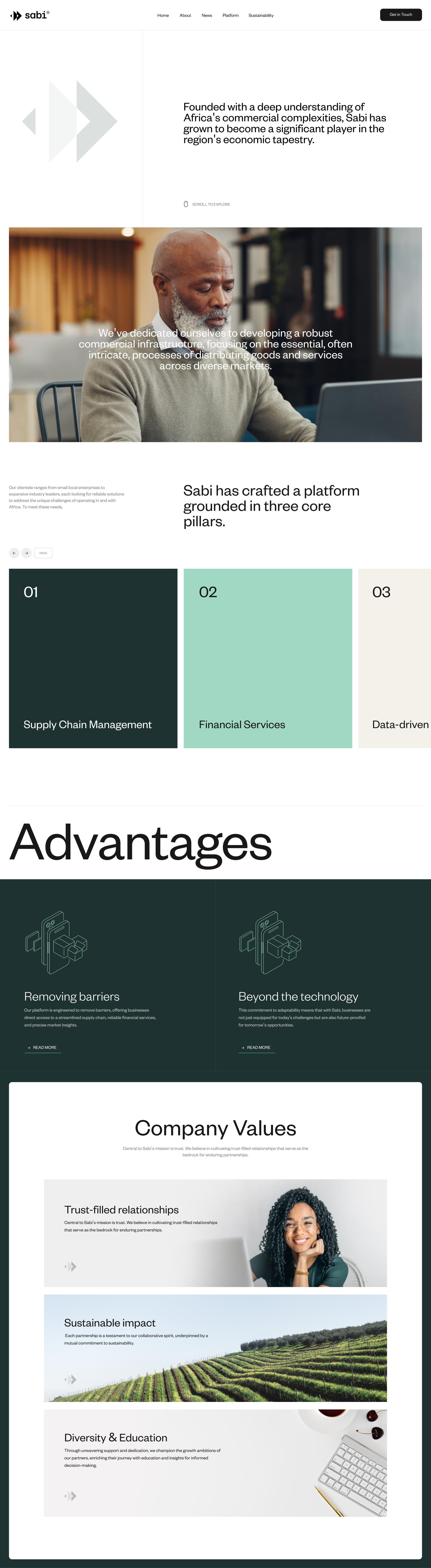
We designed a new logo and the complete visual identity, including typography, key visual, and color palette. We also designed and developed Sabi’s new website and created design templates for other promotional materials across marketing channels.
Project result
It won’t be an exaggeration to say that the Sabi brand received a world-class visual identity, helping to reposition it in the market where it actually belonged, according to its goals and target audience.
The new website design of https://sabi.am/ is way clearer and much faster. And, maybe most importantly, much better at communicating what Sabi does, helping it get the right message across to the right potential clients.


.jpg)


.svg)
