Project overview
Challenge
With a complete focus on clients, internal matters often take a back seat. While helping them grow their businesses, we don't always have as much space for our own endeavors. That's why Riotters turned to us for rebranding help. And we knew very well that designing for yourself is the hardest thing to do, and designing for the design industry is even more challenging.
Beyond refreshing the visual layer, the brand also needed a structured strategic direction and a more defined market position. We also had to build a new website, which was (and is) a key source of customer acquisition and, of course, a platform for showcasing completed projects.
Solution 247
We started the entire process by seeking answers to the question of what's behind the name and what "design rebellion" actually means. Who exactly is the brand trying to reach? We wanted the whole meaning of rebellion to take on a positive connotation and not be so literal.
After analyzing business and image goals, we developed a communication strategy and then an identity that reflected the brand's specific character. On the one hand, it still referred to the old identity, and on the other, it became a symbol of a new chapter.
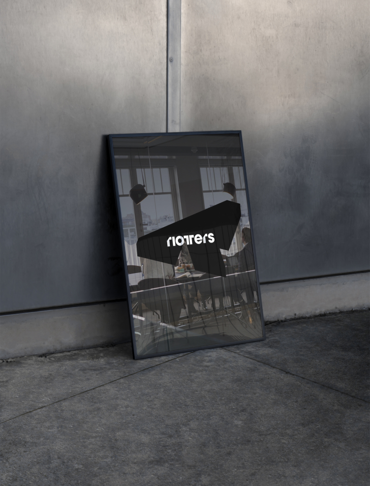
We also focused on the emerging motif of the double letter - visible in the logo, but also in headlines and CTAs. We used reversed italics and a negative motif against the previous color scheme. It was in such details that we wanted to convey this semantic perversity.
The project also took into account the flexibility of all identity elements, allowing them to be adapted to dynamic digital environments, such as social media animations and websites. We also designed a brand manual, presentations, and social media templates.
Result
Close cooperation with Riotters resulted in unique and consistent communication - both visual and verbal. The brand has acquired its characteristic tone of voice, and the new identity has provided much more opportunities for expression. The introduced dynamics also allowed for a broader presentation of the portfolio and created a new category on the market: design acceleration.


.svg)


.jpg)


.svg)
