Office
Index

HRYNIEWICKIego 10
B25. 1st FLOOR
GDYNIA 81-340
+ (48) 609 999 827B25. 1st FLOOR
GDYNIA 81-340
HANK → Enjoy the Space
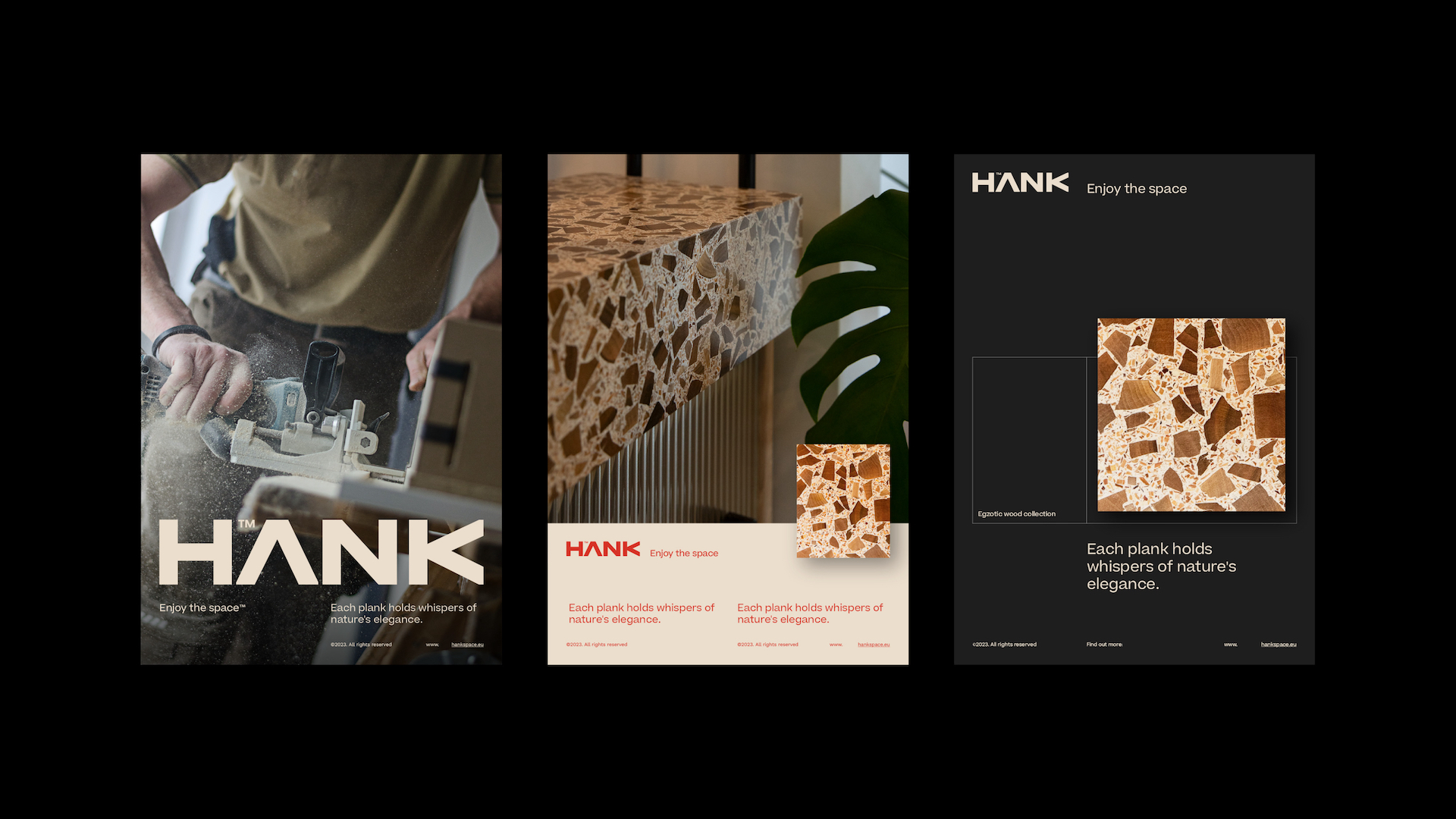
Hank combines craftsmanship with design in a truly unique way. So it was pretty obvious that the brand image had to do the same. That’s why the new branding for Hank accounted for the product, the company’s approach to the manufacturing process, and the result for the customer – a unique ambiance created with beautiful, natural wooden panels.
Scope :
Client :
HANK
Industry :
Production, distribution, sales
Year :
2024
Project type :
Branding

Hank is a wooden panel manufacturer – but that’s a bit of an understatement. The panels are made from natural materials like walnut shells or natural wood sourced in Poland. And most of all, they’re unique in their aesthetic, addressed to customers who can appreciate the design and the super high quality.

And that’s what the brand wanted us to do – to create branding and visual identity that will showcase the unique character at a glance, helping tell the brand’s story and reach the right audience.


We started with a brand audit and then designed the entire branding from scratch, based not just on the originality of the product, but also on the brand’s values and the sustainable approach to the manufacturing process, along with the versatility in interior design that the panels provide.


The space created by the panels is the key here as the ultimate product that the customer gets. To highlight it, we focused on geometrical patterns with a natural color palette and elements of bolder color. We also design the logo and the complete design system to use across marketing communication channels.


Digital Design
Communication strategy
Web Design
Frontend Development
Visual Identity
full listing