Project Overview
Project opportunity
Elivena wasn’t Elivena yet when we started working together. Besides branding and website design, they needed a new name. One that would be easy to pronounce and work for audiences globally while also hinting at the core of what the company does – which is developing wellness solutions to help people live longer, healthier lives. Oh, and let’s not forget, we needed a free domain, too.
That goal had to be clear in everything we were about to do for our new client: naming, logo and visual identity, packaging design for their future products, and a user-friendly website to eventually sell them, aligned with their customer journeys and their brand-building and sales objectives.
247 solution
We organized all brand knowledge and goals during a workshop that gave us all the insights to start the creative work. We came up with the name Elivena to hint at the concepts of “living” and “elevating”. And we turned it into a logo and key visual inspired by the concept of molecules and chemical bonds.
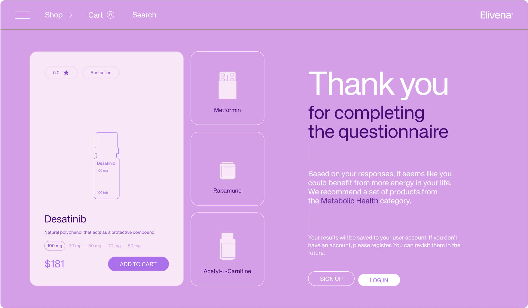
The new website design included an interactive form where customers could find relevant products based on their individual needs. We also designed packaging, branded merch, and marketing materials such as social media image templates. All consistent enough to make it easy to introduce Elivena’s own brand of products in the future and communicate them both online and offline.
Project result
From anti-aging products and chemical molecules to consistently standout branding that brings positive connotations and effectively targets the intended audience – everything came together just right in this project.
Elivena now has not only a sticky brand name, but also memorable branding that makes reaching their target customers with the right products much easier.


.jpg)


.svg)
