We turn ideas into brands,
WHICH EVOKE EMOTIONS. 24.7

B2RLAW - Breaking boundaries, transforming together, law redefined.

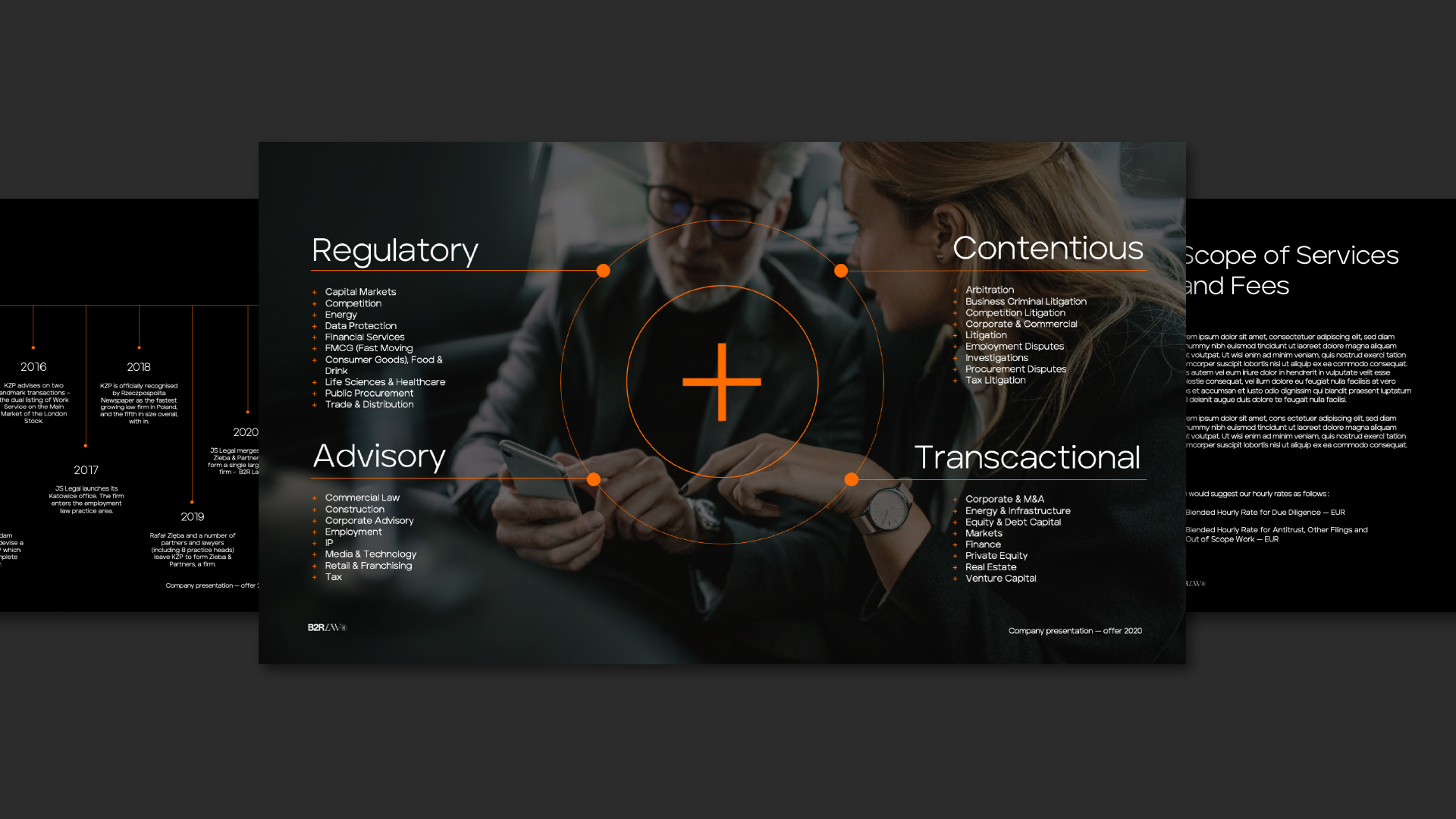
Creating a new identity for B2R Law was a task that required a special sense of the standards of the legal industry, as well as the ability to look at the brand and its surroundings. From the existing schemes, the posthumous legal framework of B2R Law comes out for more. Creating an identityrequired a focus on the Recipient. This is how we have combined aspects of modernity, such as technologies, with emblems rooted deep in tradition andperception of law.

Scope :

Client :

B2R LAW

Industry ::

law, consulting

Year :

2020

Project type :

branding

New technologies in court? Today it is standard. The Future Ready Lawyer report from 2022 clearly states that for 91% of legal departments, a significant value in cooperation with law firms is the skillful use of technology. The number of law firms in Poland is growing. The year 2021 brought as many as 18 newly created law firms to the market. Indispensable in the face of today's reality is the message of the power of penetration. We faced such a challenge when designing a new identity for B2R Law.

Lady Justice - the allegorical embodiment of moral force in judicial systems - has become the leitmotif of the brand's identity.

Descended from the personification of justice in the art of ancient Rome, she became the patroness of B2R Law. Accompanying attributes such as an eye band, a weight and a sword were used. The ancient goddess of justice was juxtaposed with the minimalism of www. This is the most important channel for brands in the legal industry. Therefore, its simplicity has been taken care of allowing you to move freely and intuitively

The legal industry, like most fields, is undergoing significant transformations as a result of the development and implementation of new technologies. And the emergence of a newly formed law firm - B2R Law - is giving direction to these changes.

Aventa typeface. Geometric font tailored to the aesthetic tastes of contemporary times. Strong and clear finishes give character to the whole, harmonizing with the minimalism of the design.

The website is equipped with classic and subdued colors: gray, white, black. The composition was highlighted with orange color intended to indicate a modern twist of the brand. In order to enhance the quality of the user experience, the site has placed tools to facilitate navigation, such as search engines and filtering of results.

Digital Design

Frontend Development

Web Design

Communication strategy

Visual Identity

full listing